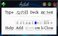
In the Google forum, there came up the question if there was a way to make the add card window smaller. This is a quick hack that removes the size limit.
While it can be argued that the original limit of 400 × 400 pixels was too large, there still is a good reason for some minimum size, as the window becomes useless when you reduce the size too much. Just make it bigger again in this case.
The add-on also adds a toggle button to hide or show the model and deck selectors.
This is in Anki 2.0 style, and will not be updated.