This is an Anki 2.0 plugin. I think i will update it to 2.1, but don’t know when i will get around to it. If you are impatient, you can of course do the update yourself. Please let me know which way you want your version published.
This loads the local CSS file user_style.css and adds the style to
the CSS set in the card templates.
It also adds a few classes to the cards.
With this, the look of the cards can be adapted to the time of day (night colors) and place (small fonts on small screens, big fonts on big screens, …)
Set-up
The add-on loads the file user_style.css from the current profile’s
directory, typically Anki/User 1 or Anki\User 1.
You have to create the style file yourself. That is the point of the add-on.
Typically the standard styling in the card template isn’t changed. Like this, reviewing on AnkiWeb and on mobile devices works as before.
Classes
The add-on adds the classes loc to all cards. The model and template
names of each card are reduced to the characters a to z, A to
Z, 0 to 9 and _ and added as classes as well, in the form of
model_NN and template_NN. As an example, the second card of a
model or note type called Satz Japanese 日
本語
and that is called Hörübung
would
have the CSS classes loc card card2 model_SatzJapanese
template_Hrbung. These classes can be used to build CSS selectors.
Standard use
To apply a style to the whole card only on a specific computer, use the
user_sytle.css file on that computer. You should use the CSS selector
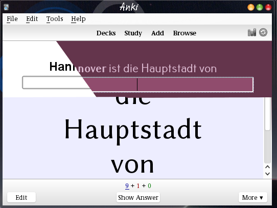
.loc.card. The example in the bottom of the image was done with
.loc.card{
  font-family: Linux Biolinum O;
  background-color: #ededff;
  font-size: 58px;}
The selector in the style file must be more specific than the one used in the template in the collection. When a setup for.cardis used in the template, the style file should use.loc.card, not just.loc
Sub-elements
The easiest way to select only parts of a card is to add classes with
the <div> or <span> elements. For example a Japanese answer can be
written as <div class="nihongo">{{furigana:Japanese}}</div> in the
back template of a card.
Then, different Japanese fonts can be selected on different computers
by using .loc .nihongo{font-family:
IPAPMincho;} in
one style file and .loc .nihongo{font-family:
"Moon font";}
in another.
As thelocandcardapply to the same object, the selector.loc.cardcontains no space. When setting the style for a sub-element, a space must be added. For example, to change the style of the Japanese text, use.loc .nihongowith a space between thecand the..
Different cards
Applying different styles to different cards works in a similar way.
As an example, in the past i used a standard style of black on light
blue for standard cards and black and light red for grammar cards. In
the alternative style i used light colored text on dark background,
dark green for normal cards and dark red for grammar cards. The
standard cards use the the .loc.card selector described above. The
model name of the grammar cards is Grammatik VHS —
Japanese
and so i used
.loc.card.model_grammatikvhsjapanese{
  background-color: #64354c;
  color: #d9b7ce;}
to set up the pink-on-dark-red.
Night mode
The add-on adds a Mode (extra class)
sub-menu to the Edit
menu to
switch between night mode and normal (day) mode.
Without further set-up, this switch has no visible effect,
all it does is add another class night. The user has to set up
eir collection to make use of this.
Set-up
The set-up is best done in the user_style.css file. To use
white-on-black as a night mode alternative to standard black-on-white
cards, you should add
.night.card.loc {
  color: white;
  background-color: black;}
It is also possible to add definitions for .night in the card
templates themselves. This way it will probably work with the
AnkiDroid code i intend to write to bring night mode there.
More modes
More display modes can be used. Edit the source file.
Look for
near the top. Duplicate the extra_classes_listNight
mode line and change the texts after the class and display
bits.
For example, i use the
solarized
color schemes. I
use the light theme most of the time but sometimes want the dark
theme. I also sometimes want to see the cards in black-on-white.
The point here is that the dark scheme can’t really be derived from the light mode, so it has to be set explicitly in a style sheet.
The relevant bits of my templates look like this:
.card {
  color: #657b83;
  background-color: #fdf6e3;
}
.night.card {
  color: #839496;
  background-color: #002b36;
}
.highc.card {
  color: black;
  background-color: white;
}
And i have added
as entry to the menu:highc
extra_classes_list = [
    {'class': 'night', 'display': u'Night mode'},
    {'class': 'highc', 'display': u'High contrast mode'},
    ]
No night mode
Similarly, the mode switch menu can be turned off by deleting the
night mode line of the extra_classes_list in the source.
Different styles through different files
The old way to use different styles at different times was to have two
style files like day_user_style.css and night_user_style.css handy
and replace the file user_style.css with the fitting one. On file
systems that support them (i.e. basically anywhere but on Windows
systems), soft links can be used instead: ln -sf day_user_style.css
user_style.css.
Reloading
The user style is loaded when the profile is opened. To reload the
style after a change go to the Switch Profiles
dialog and re-open the
profile.
AnkiDroid
When the class night_mode instead to night is used, and when the card styling uses this night_mode class, the day/night mode switch behavior of Anki desktop should match that of AnkiDroid.