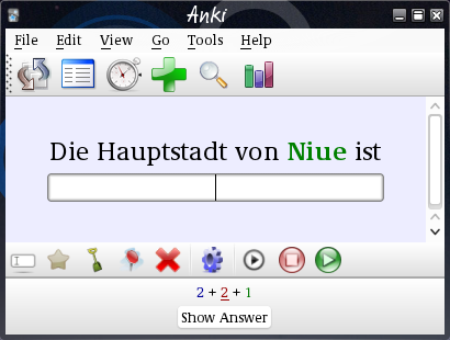
I am in the process of updating this for Anki 2.1. At one time parts of this worked with Anki 2.1 and others didn’t.
This add-on replaces the top menu bar with the Decks Study Add
Browse
text buttons and the two rather drab sync and statistics
buttons with a colorful icon toolbar like the one in Anki 1.
The edit button and the more button in the bottom bar are also replaced by an icon tool bar.
This also adds a few more menu items and adds icons to the menus (not
on Macs). The tool bars can be shown and hidden via the “View” menu,
the Decks Study Add Browse
functions can also be reached
through the Go
menu.
Menu-only items
Two items are added only to the menus, not to the icon bars:
In the View
menu, there is a Mute
switch. It works similar to the
Automatically play audio
setting in the deck options (General
tab). Audio on the card is not played when the card is shown, but only
when are pressed. This options works for all decks, and can
be switched on and off quickly.
The Go
menu contains a Last card
switch. When this is active,
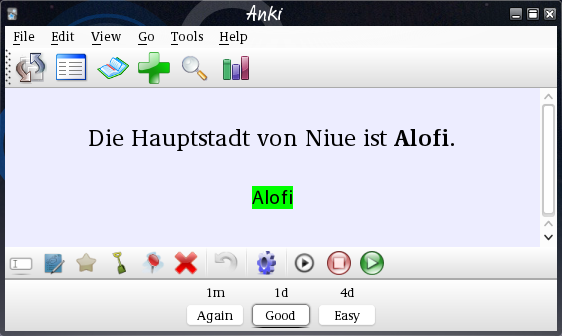
rating an answer (clicking Again
, Good
&c.) goes back to the deck
overview screen.
Variants


The appearence can be changed by editing the add-on
source file
by activating the Tools/Add-ons/Colorful toolbars/Edit…
menu
item.
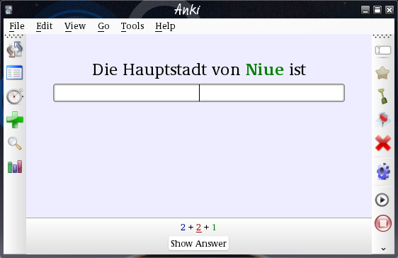
The file contains a switch to chage the add-on to netbook mode. When
the netbook_version = True line is active the the two icon bars are
on the left and right, to
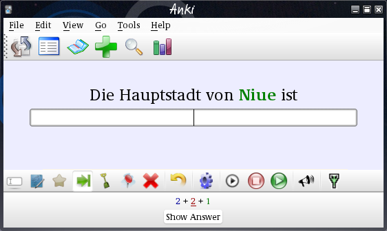
preserve vertical screen space. To get to my personal variant with
different buttons in the bottom bar, take a look at the git branch
develop-ospalh-special. Remember
to also get the
icons directory
when you get the add-on from github.
There are also switches to show the Mute
and Last card
switches in the bottom icon bar.
UTSL for further changes to the icons shown.
Replacing icons
The icons used are stored in the folder
Anki/addons/color_icons. They can be simply replaced by icons more to the
personal taste of the user.
What is the capital of Niue?
